How to Match Brand Colors on Products
Your manual’s blue on screen will never match the blue printed on a matte power bank or embroidered on a cap. Brand colors on physical products are an agreement among reference, material, and process—not a pixel-perfect promise without proof. Here is how to align expectations and outcomes.
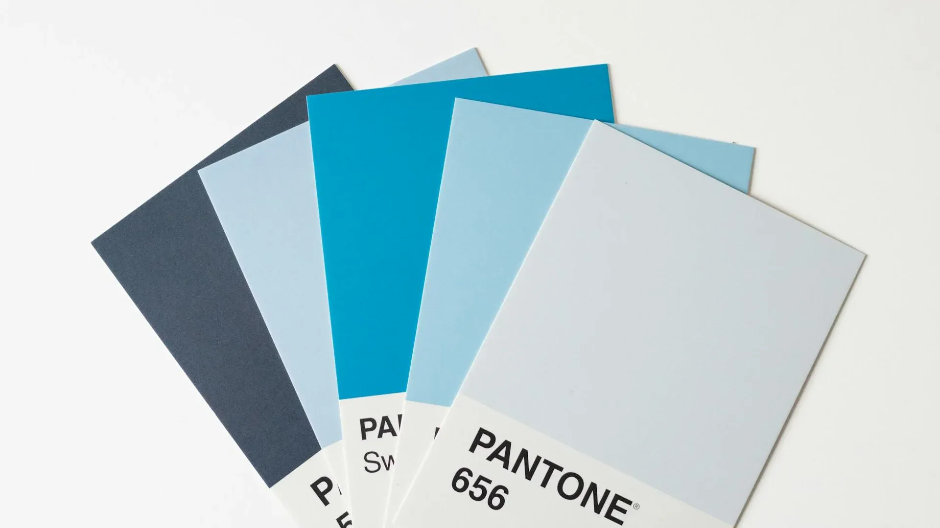
Start From Pantone (or Equivalent)
State Pantone Solid Coated (or your manual’s series) as the primary reference. If the supplier mixes inks, they match to the swatch book; in digital/UV, conversion goes through device profiles. Document which reference wins when web RGB conflicts with packaging solids.
The Substrate Changes the Color (Fairly)
The same Pantone on white vs gray plastic vs anodized metal shifts with absorption, gloss, and texture. A vivid red in cotton screen print will not match soft silicone the same way. Serious brands sign color tolerance (ΔE) or approve lab drawdowns on repeat orders.
Technique and Ink Count
Spot screen print stays consistent across runs if screens are maintained. Digital allows more nuance but can vary by machine or ink lot. Laser does not “print color”: it reveals substrate; brand “color” there is the metal or anodized layer itself.
Sampling Protocol
- Request a chip or print proof on the same material as bulk.
- Judge under standard light (D50/D65), not only warm office lamps.
- Archive the approved sample as the pattern for reorders.
Reorders and Lots
Between ink lots or digital rolls, minimal drift may show only if you place last year beside this year side by side. If your brand is strict on color, plan reorders to either mix old and new stock on the same show table or retire prior stock deliberately.
In textiles, the same Pantone on cotton vs polyester will never be twins; document “approved on cotton” separately from “approved on poly” to avoid unfair comparisons.
Archive standard-light photos of each approved lot; they are useful evidence if internal clients dispute a match.
Digital Tools vs Physical Samples
Web simulators help preview, but perception under office LED differs from a show with mixed warm and cool light. Use digital to quickly drop bad options and physical for the final call.
Share stand or uniform photos where the product will live to judge contextual harmony, not only isolated match on a table.
Communication With External Design
If you work with a creative agency, contractually require merch-approved logo variants, not only screen-ready art. Many digital manuals ignore how gradients map to physical inks until the first order lands.
Schedule a short handoff where the POP supplier explains register limits and minimum strokes; design adjusts expectations before client presentation.
Lighting at Approval
Approving color under warm tungsten versus cool LED can split a committee. Standardize the light box or at least document which lamp was used when everyone said “yes.” For remote approvals, ship two physical chips when stakes are high—photos still lie about saturation.